
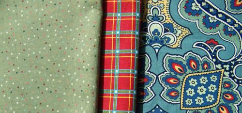
Step 1: Fall in Love - Usually I start with a print for which I have fallen head over in heels. It's usually the largest of the prints and has many colors from which to pull coordinates. Most frequently it's a paisley or a floral, but sometimes a figural print such as a toile. Below is one I found at JoAnn's recently and bought a 1/2 yard to use as an example for this tutorial. I LOVE this print and would probably use it in a quilt or perhaps a Country French-ish tablecloth.

Step 2: Mad for Plaid - Add a plaid or similar geometric. Pull one of the colors from the print to be the predominant color in the plaid, but make sure the other colors match as well. The plaid should be smaller in scale than Fabric #1 so it does not compete.

Step 3: Go Dotty - I like to add a polka dot next. It can be simply one color on a background that coordinates with your inspiration print or incorporate all the colors as this dot below does.
Step 4: Toss One In - Next I will look for a tossed motif print that adds a bit of whimsy. Something a little funky. These little bones are perfect and the blue background is a great match to the inspiration prints blue. If funky isn't appropriate for the project, I may look for a tone on tone print, perhaps in a floral if I'm working with a paisley or a small paisley if I'm working with a floral.

Step 5: Warm It Up or Cool it down - Most of my colors so far are very cool. I need a warm shade to sunny things up. So I chose a yellow. The chicken wire motif also picks up the hint of country that is suggested by the Country French paisley. If I had mostly warm colors so far, then I would cool things down with a cool print. Keep the print small or tone on tone so things don't get too cluttered.

Step Six and Seven: Racing Stripes and a Touch of White or Black - These are two optional final steps. If desired, I might add a stripe. At this point, the stripe is debatable for me. I'm pretty happy with the set so far and I have a geometric with my plaid. So I could go either way. If I was doing a quilt where lots of prints are needed, it would stay. If I was doing a strip-pieced border on an apron, I would probably pass. And then finally...most quilters recommend a touch of a light neutral or a black to give a little punch. I don't like adding in solids to lots of prints. They stand out too much and detract from the happy mix of prints. So if I was going to add a white, I would do one like this that had a very subtle print to it, but at a casual glance appeared mostly solid.

Here are some other mixed prints I've done through the years...
Large Floral Inspiration Print + a small floral + a paisley + a polka dot.
Large Floral Inspiration Print + a small geometric + a polka dot.
Toile + Polka Dot + Stripe + Floral.

Inspiration Print + Plaid - Stopped After Step Two

Tablecloth Inspiration + Plaid + Stripe + Various Tossed Motifs


15 comments:
Fantastic tute! Thanks so much. I'm terrible at this (probably why I'm not a quilter:-) and even seeing you put it together, I though "I could never do that". But I'm tempted to try now that you've explained it so clearly.
Love your new blog look!
Thanks for this pattern mixing/matching tutorial. I'm a weany (weiny? weeny?) when it comes to mixing prints. I usually do a print with a solid and that's it.
Love your blog! Great tutorial!! I`ll be back.
1. Great tutorial and photos.
2. To reply to your comment on my blog about body image and sewing satisfaction, I think that's also the reason why I don't like so much of what I make. Sigh...
Thank you. It's become abundantly clear to me that I needed a lesson in how to do this after a few failed attempts. Your easy to follow suggestions will follow me to the fabric store.
This is my biggest challenge in quilting. I do lovely work with my needle, but I have such trouble deciding on fabrics. Thank you for the help. It really makes sense to me.
This is soooo great! Some people find it hard to co-ordinate fabrics but you have done a wonderful job of explaining it in a nice, straight-forward way! Now I'm off to look at the rest of your blog :)
This is great. Thanks so much. This is really going to cut down the time I stand around the fabric store wondering what the heck goes with what.
Awesome! You explained it so well - I will be making note of this.
This is incredibly helpful and something I've always struggled with. I have book marked your tute :-)
thanks so much!
Thank you, thank you! Very helpful indeed, I needed this!!
great ideas!
I really needed this tutorial. I am not a quilter but I love to see this concept used in little girls' clothing. I sew for my little granddaughter and have never felt secure in the fabrics and colors that I combine for her clothes. This has really helped me and I have the notes that I've taken in case I forget this when I head for the fabric store. Thanks so much for sharing!
thank you for the tutorial! it's very useful and just what i need. I've always confused combining pattern but you make it so easy and simple :) i'm not good at sewing and i'll apply your tutorial to my handmade cards instead! thank you thank you sooo much!!
Thanks for these step-by-step tips... very helpful!!
Post a Comment